
Yesterday, my mom & I went antiquing several places west of San Antonio (mainly Castroville & Uvalde). Antiquing offers up a treasure trove of patterns both good and bad. Full post contains some of the best & worst from the trip. Lots of photos (not dial-up friendly).
Teaser: Rugs are whole pattern-fest on their own. But here's a sampler.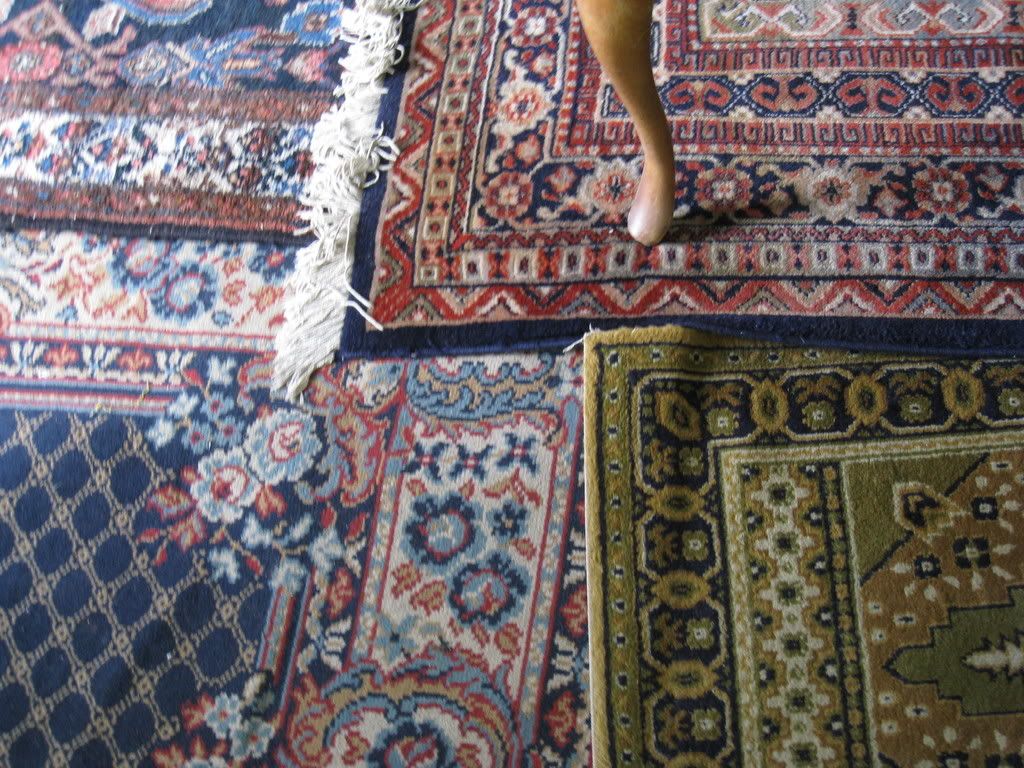
As far as antiques go, it appears the really crazy upholsteries are on the chairs. Like so: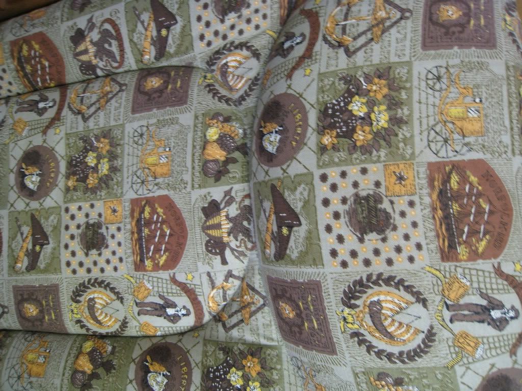 It's like a summer-style naval pattern. Way too busy for me.
I found a pattern somewhat similar to my recently replaced tablecloth: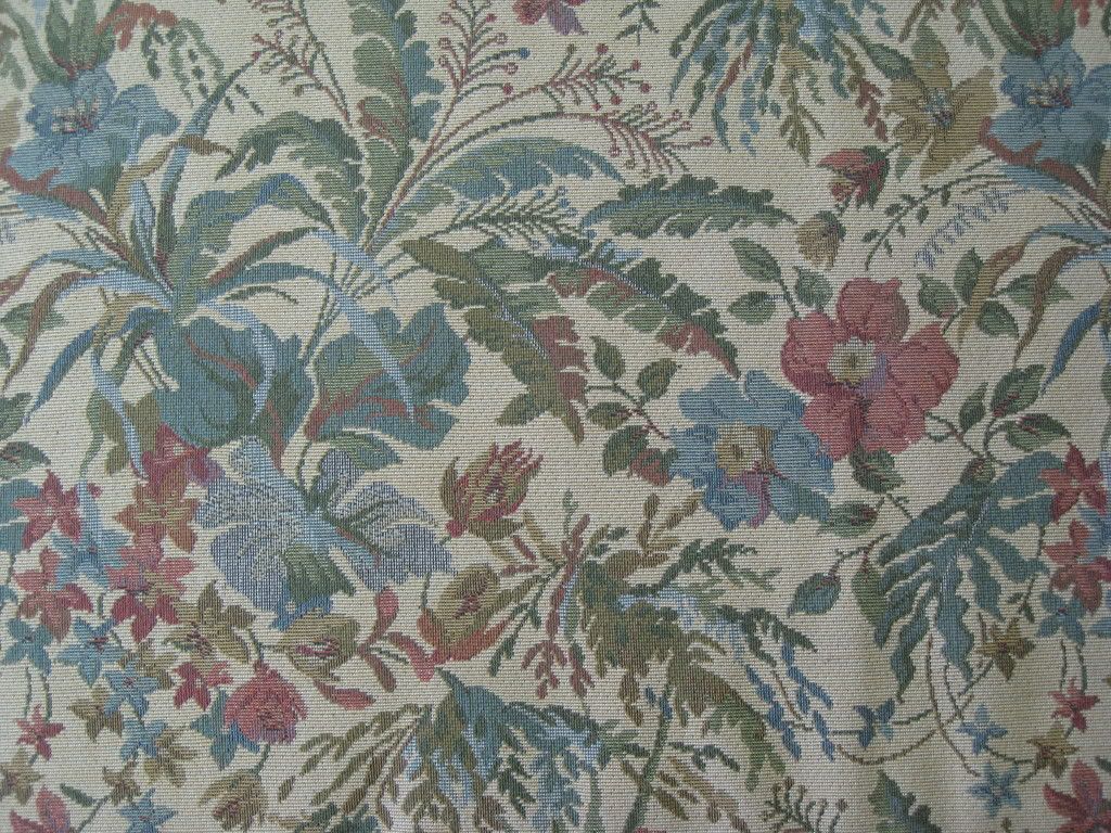 A little lighter than mine but still quite appealing, I think.
The same I cannot say for the overly pink setee: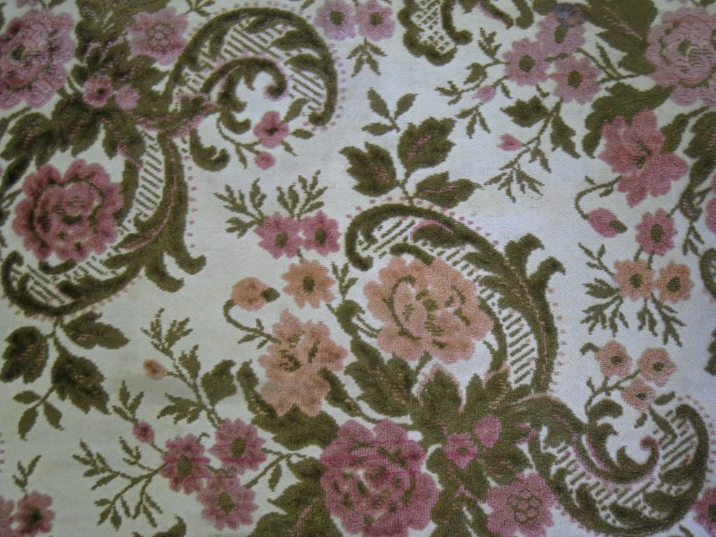 Yuck.
Yuck.
Remember: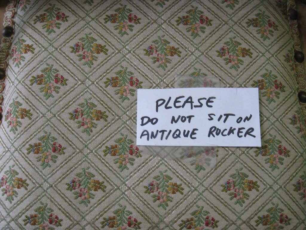
I bought a cabinet on this trip and when we went to load it, I noticed on of my Mom's blankets:![]() Whoa, this is ugly! And very, very pink.
Whoa, this is ugly! And very, very pink.
It's not just chair that have outrageous prints. Here's a tablerunner: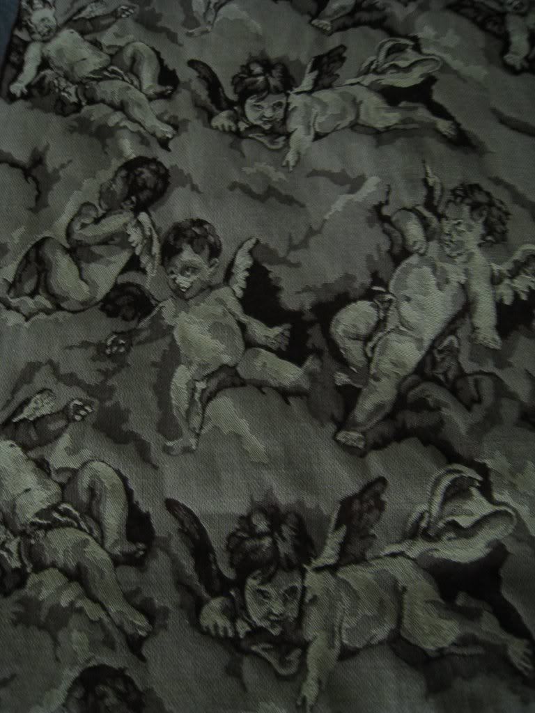 Why would anyone think "depressing, mutant Cupids" is a good motif?
And someplaces have old scarves. Most of the time, they're pretty good. However, there are exceptions: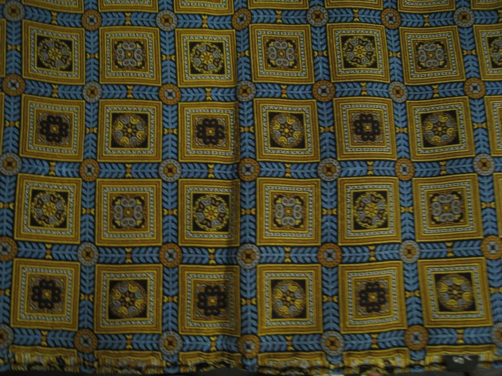 I'd feel like I was wearing an ornate tile floor around my neck. Or Celtic traffic signs.
Some of the chairs have absolutely lovely prints. Here's one I was really surprised by: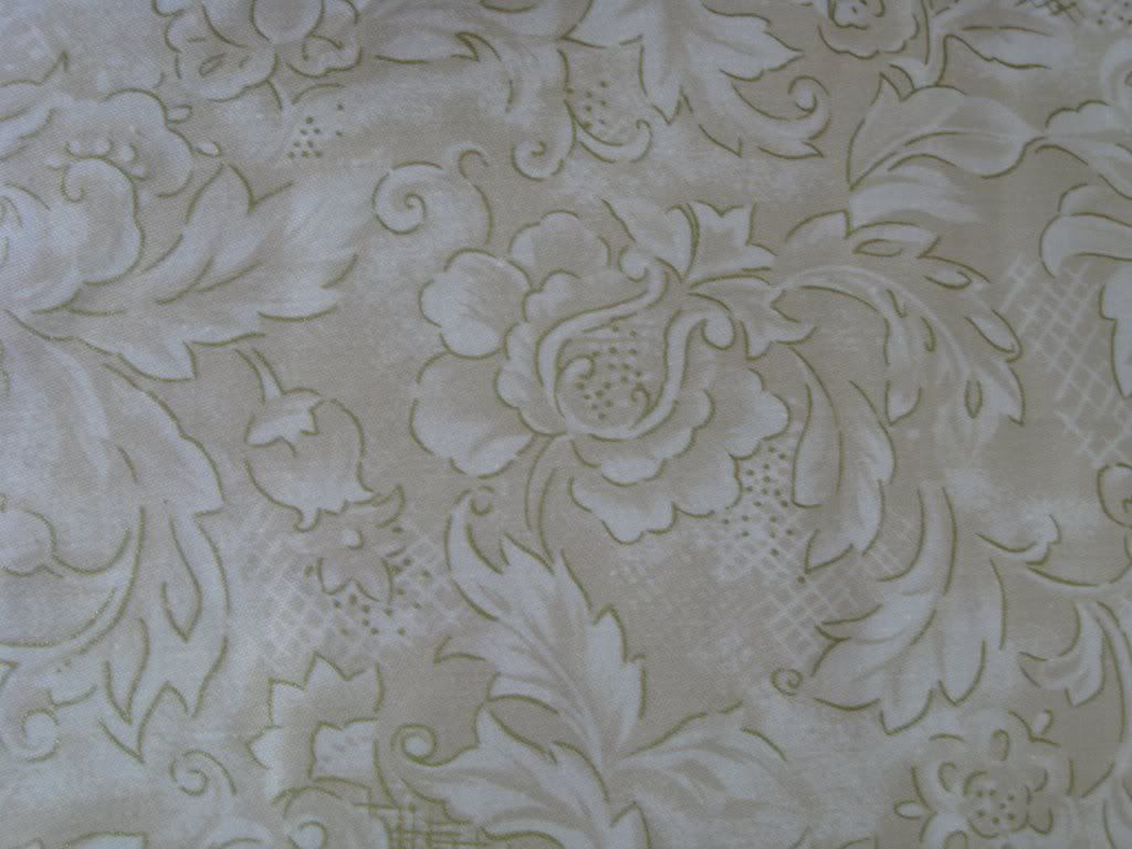 Very light coloring but it's pretty.
There's also this very colorful piece: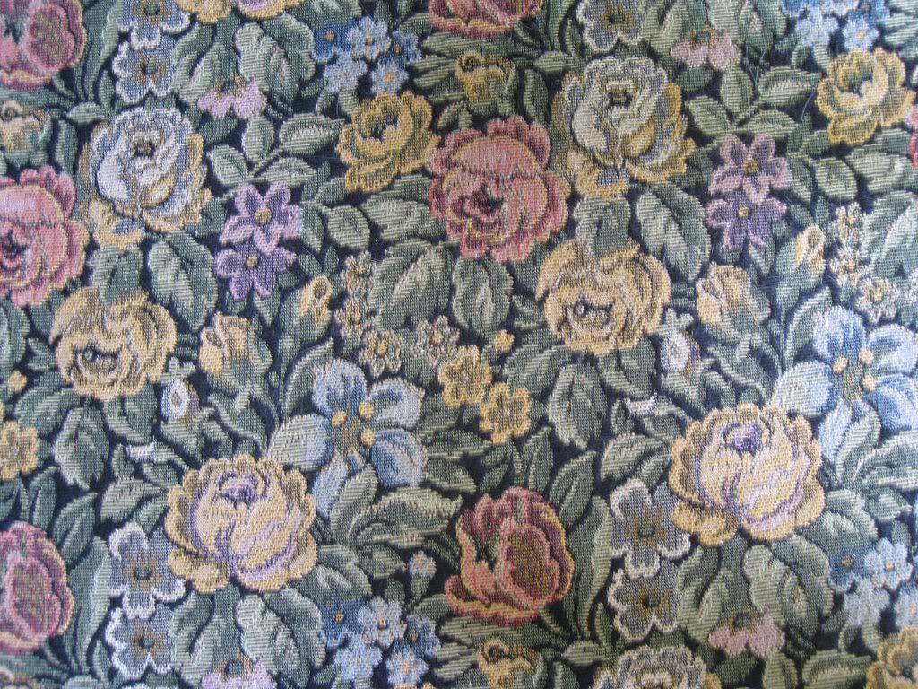 I wouldn't want a whole room done with this, but on a few throw pillows, it'd be great. Because of all the colors in it, you could use it after redecorating several times.
That was good use of color. This is bad use of color: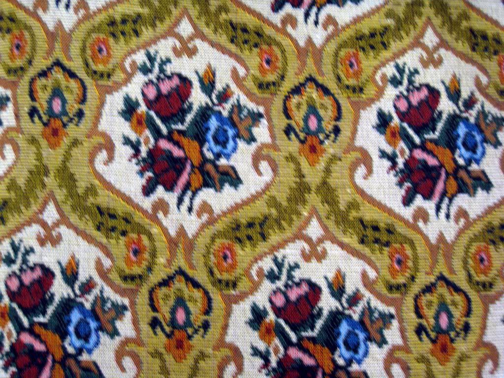 Staring at this too long makes your eyes tear.
Of course, sometimes you discover something so outrageous it redefines “bad”: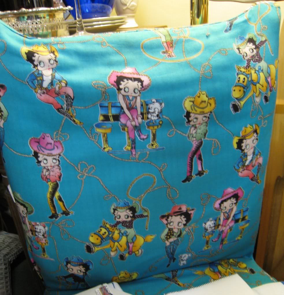 Betty Boop upholstery = SO VERY WRONG.
Now, antique shops always have a lot of rugs. For the most part, they are pretty vanilla neo-victorian prints. There are exceptions, both good: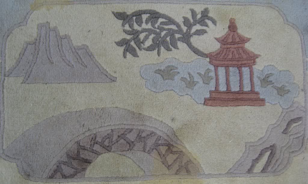
And bad: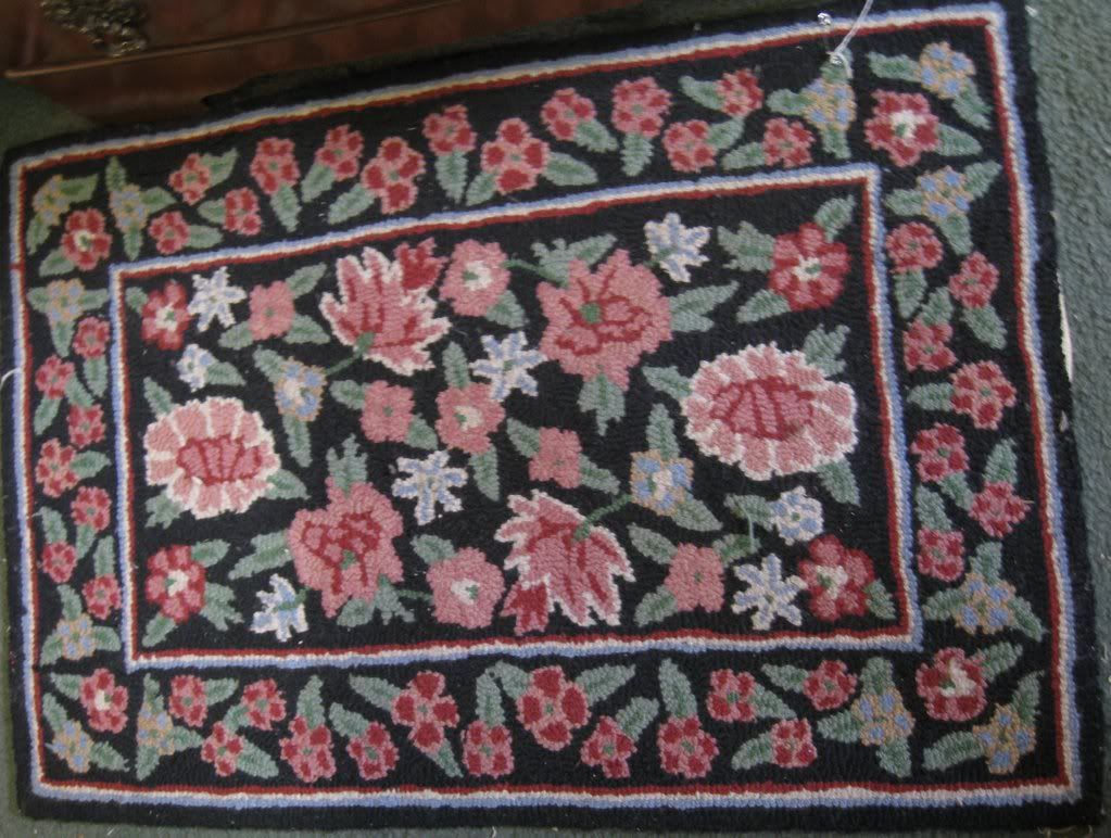 It looks like the welcome mat to Strawberry Shortcake's home.
A lot of places include quilts in their displays. Again, most of the time they are pretty much what you expect. But occasionally, there's some pretty crazy patterns: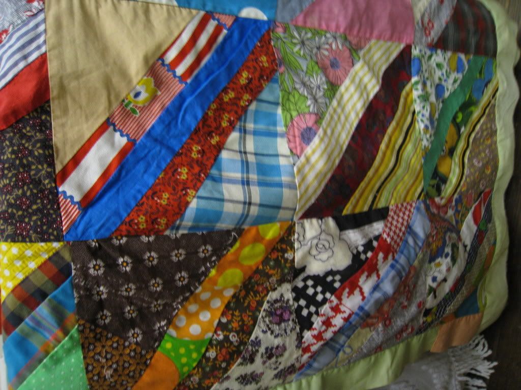 I feel like a colorblind person's scrap bin was used to make this quilt. Having said that, it's so crazy I almost find it appealing...Almost.
One place had a whole quilting room, which would have been cool if it wasn't for this thing: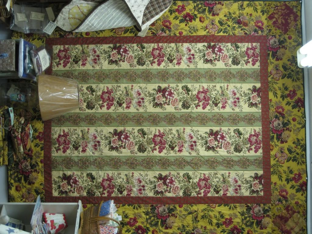 AHHHH!!! Flowers Everywhere! Run Away Before the Vines Get You!
I also really, like the screens used to divide up the rooms. Usually these have floral patterns or are solid wood colors.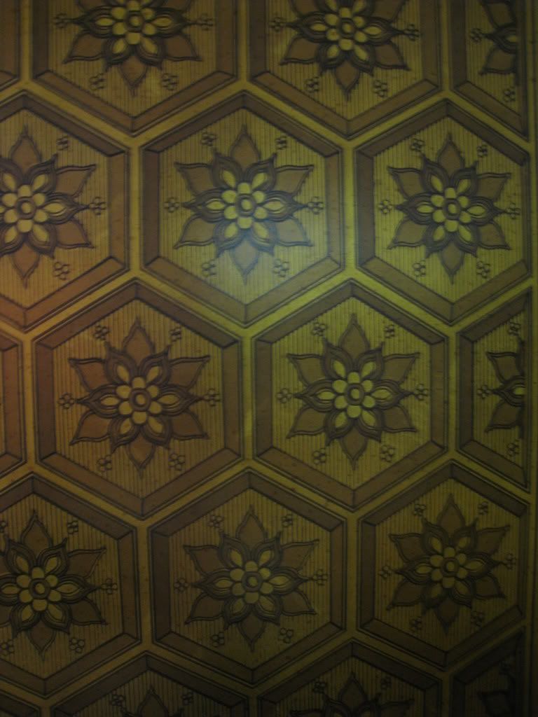 Given the gold color, I shouldn't like this but the geometric print is just too wonderful.
Certain patterns would be overwhelming if done in bright colors: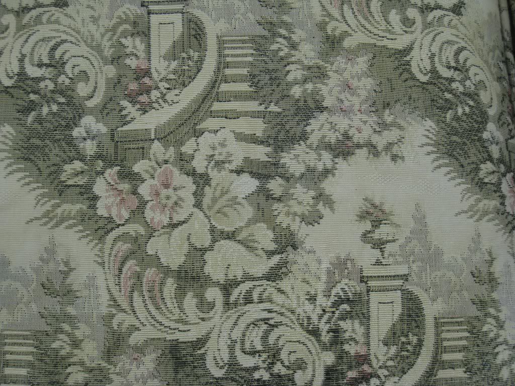 But when done in washed-out or monochromatic tones, they look pretty darn cool.
Some patterns have no hope color-wise: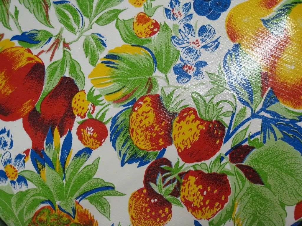 *shudder*
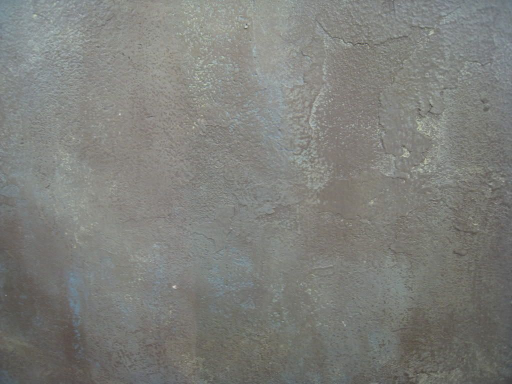
In addition to the stuff inside antique shops, occasionally the walls and floors offer worthy textures and colors of their own. These include:
Shiny concrete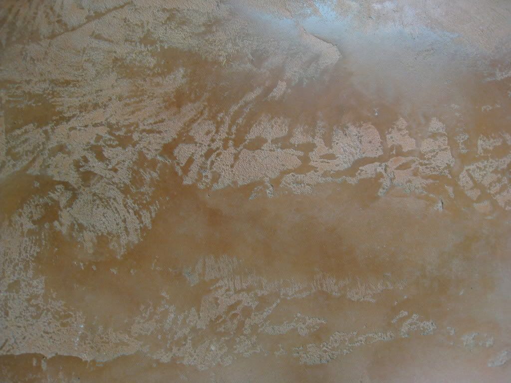
Wooden walls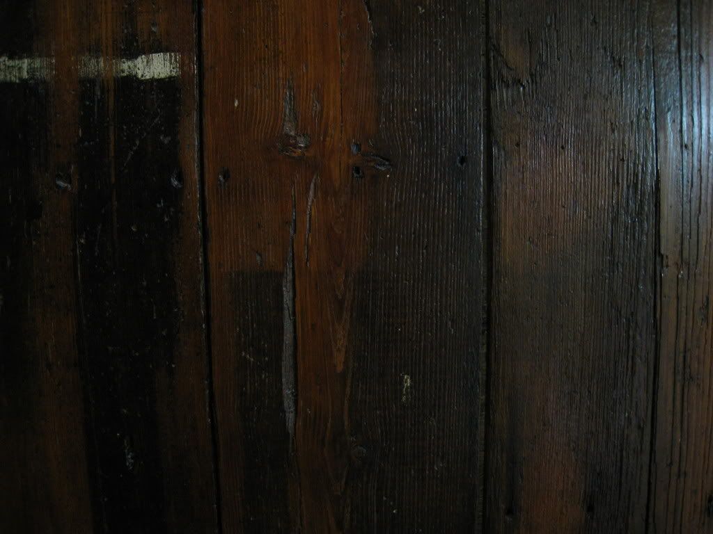
Granite Counter-tops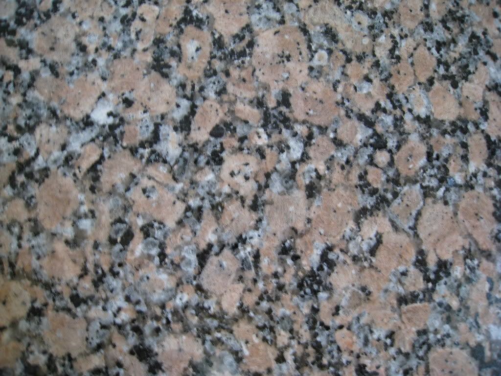 Or colorful walls
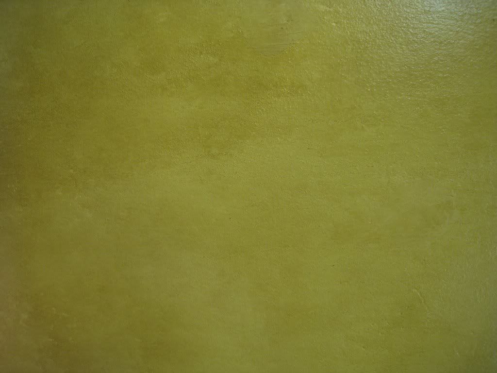
 I'd really like to try several of these out as desktop wallpapers. Could lead to some different-looking themes.
*Ends post because she is thinking about redoing her desktop...And she ran out of photos*
Sunday, June 8, 2008
Antiquing Patterns
Subscribe to:
Post Comments (Atom)


No comments:
Post a Comment